In the world of the internet, your website is your digital storefront, and every visitor is a potential customer. But how do you convert these visitors into active participants, subscribers, or clients? The answer lies in the art of crafting compelling CTA(Call-to-Action) buttons and forms.
In this post, Kwikaweb will explore the strategies to create effective CTAs that captivate your audience and drive meaningful engagement on your website.
1. Clarity and Simplicity
The first rule of an effective CTA is clarity. Your visitors should immediately understand the action you want them to take. Use concise and action-oriented language.
Whether it’s “Subscribe Now,” “Get Started,” or “Download Your Free Guide,” clarity ensures that visitors know exactly what to do next.
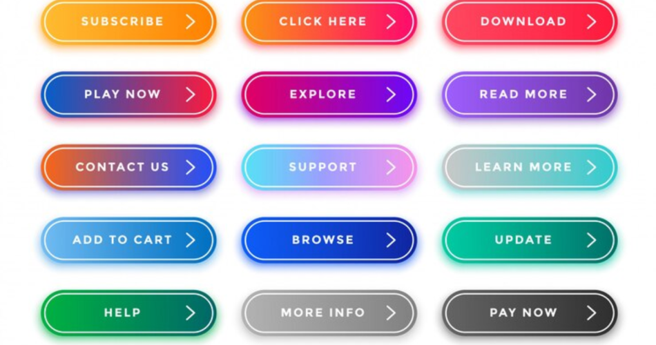
2. Eye-Catching Design
CTA buttons should stand out. Use contrasting colors that complement your website’s palette to draw attention. Consider the psychology of colors; for example, orange and green often signify action and positivity.
Also, ensure the button is of an adequate size, making it easy to tap on mobile devices.
3. Compelling Copy
The words on your CTA buttons matter. Instead of generic phrases, use persuasive language that conveys value. For instance, replace “Submit” with “Get My Free Consultation.”
Highlight the benefits users will receive by clicking the button, making it irresistible to engage.
4. Strategic Placement
The position of your CTAs significantly impacts their effectiveness. Place prominent buttons strategically on high-traffic pages, such as your homepage, product pages, and blog posts.
Additionally, consider using sticky or floating CTAs that remain visible as visitors scroll, ensuring the opportunity to engage is always present.
5. Optimized Forms
Forms are powerful tools for capturing user data and generating leads. Keep forms concise, asking only for essential information. Implement smart form fields that adapt based on user input, reducing friction.
Use micro-interactions, such as subtle animations or feedback messages, to guide users through the form-filling process seamlessly.
6. A/B Testing and Analysis
Implement A/B testing to evaluate different CTA variations. Test different colors, text, placements, and designs to determine what resonates best with your audience.
Analyze user interactions using tools like Google Analytics to understand which CTAs are performing well and refine your strategy accordingly.
At Kwikaweb, we specialize in creating websites that not only look stunning but also engage visitors effectively. Implement these CTA strategies and watch your conversions soar.
If you’re seeking a partner in crafting compelling online experiences, choose Kwikaweb.